
I. Why does it matter?
Often in my industry, I read that effective graphic design isn’t that hard. In some ways that’s accurate. It’s certainly not as time-consuming as it used to be, thanks to the tools and technology developed to streamline every part of the process. Graphic design was way more complicated before the emergence of digital tools in the 1990s. That said, there’s a difference between making a readable flyer and an arresting piece of graphic design. The difference requires understanding the reason for design rules, practical application of those rules, and attention.
Paying attention to the small stuff matters. Great concepts die on the table when the artist stops at ‘fine.’ In a world full of pre-made templates a couple clicks away, custom design needs to be doing it better and cleaner to compete. There are quicker methods to make your work clean and deliberate than existed even five years ago. But you need to notice when your work needs polished, and you need to be willing to put in the time.
Attention to detail is a big deal in graphic design. It’s what separates the okay finished projects from the really effective ones. One of the simplest places to start is alignment.
Let’s go!
II. Alignment can make or break your design.
Small details make a big impact whether you’re building a logo, brochure, or website. Alignment is a small detail with a huge impact on your finished piece. It’s a design term that refers to what direction your text and images start from, or what side of the canvas they gravitate towards. Corel offers a helpful glossary of terms for the different kinds of alignments.
Your prime options include:
- Left
- Center
- Right
- Justified
There are also top, middle, and bottom alignments, but those alignments apply in more specialized circumstances.
I like to think of it like a magnet. Imagine a box of iron filings, or a Woolly Willy if you’re an Elder Millennial like me. If you hold a magnet to the left side of the box, the iron filings all gravitate towards the left edge. The alignment setting you choose dictates where you put the magnet.
Left-aligned text is what you see most typically in books and other large blocks of text. When the text gets to the right edge of the space and wraps to start a new line, the new line starts at the left and continues to the right.
Left-aligned text looks like this.
Right-aligned text still reads in the same way as left-aligned text, but new lines of content end on the right margin.
Right-aligned text looks like this.
The center point of a line of center-aligned text matches up with the center point of the whole block, and all lines match up to the same center point.
Center-aligned text looks like this.
Justified text is spaced to fill up the whole area of a block of text. Justified text is easy to spot because the margins of a block of justified text are so straight that if the block is turned on its side, you could walk across it without falling into any potholes. The drawback of justified text is that it can create some strange-looking spaces between letters and words, and all of that extra space can make the text harder to read.
Alignment is an easy way to show relationships between elements in your design. You can use alignment to connect a heading and description, and simultaneously show that block of text is separate from another heading and description. Seems easy enough, but playing with alignment can also make your finished piece harder to read. Every change in alignment that you make needs to be deliberate – you need to be able to explain why you’re doing it.
III. Tips for improving alignment in graphic design
You can improve your alignment accuracy with some simple tools. All design software in the Adobe Creative Suite offer grids and guides to help you out. You can find the controls for grids and guides under the View menu in most software.
Guides
Make sure your guides are turned on first. Go to the View > Grids & Guides > Hide Guides, and make sure that Hide Guides is unchecked. Second, make sure your rulers are turned on. If you can’t see rules on the left and top sides of your art board, right click anywhere on the (typically gray) area outside the margins of your project, and select “Show Rulers.” Now, click and hold the left mouse button anywhere on the top or left ruler, and drag towards your project. You should see a bright cyan line following your cursor; drag this line where you want your margin to be, and release to place it. You can add as many guides as you want. Guides can be deleted one at a time by clicking on them and hitting your delete key, or you can delete all of them in your Grids & Guides menu.
Pro Tip! Use the ‘Snap to Guides’ and ‘Smart Guides’ features often… and know when and how to turn them off. These features are in your Grids & Guides menu. The Snap function allows objects to jump to the next grid or guide location on your project as you move them. Smart Guides anticipate where you may need a guide – like one to show you where the next evenly spaced photo box would be in a gallery – and give you temporary guides as you move an object. These can be very helpful, but don’t marry them. They’re only as smart as the designer, and they can become a hindrance to accurate alignment when they pull objects to an incorrect position as you attempt to move them.
Grids
Grids are exactly what it says on the tin – thin, uniformly spaced lines that appear on your project artboard to help you align text and objects. You can also turn these on and off in the Grids & Guides menu or assign them a shortcut. Grids and guides are non-printing; they won’t show up on your finished print or digital piece unless you specify in the print menu that you want them to be visible.
I highly recommend turning grids and guides off periodically as you work. Otherwise, you may find yourself subconsciously incorporating them into your design. The space will look different without the presence of those bright blue lines.
The Align Palette
If you need a series of objects to align, select the objects and open your Properties palette. If you don’t see the Align palette pop up, go to Window > Object & Layout > Align. This palette allows you to adjust the alignment of a series of objects and gives you the option to align respective to their current position, or align them respective to the margins of the project, page, key object, or spread. This palette is also helpful in aligning a series of objects to be equidistant from each other. When attempting to distribute objects evenly, don’t eyeball it, and don’t trust smart guides. Use the Align Palette.
IV. Double-check
Take the time to review your work as you go, and don’t settle for ‘good enough.’ This is where attention to detail gets difficult, and alignment makes the difference between looking good and looking like you’re barely acquainted with Canva. Are your objects spaced consistently? Does your choice of alignment make sense for the document?
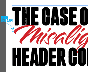
Some fonts don’t line up perfectly to the edge of the text box; does your text look aligned correctly with objects around it when you turn all guides and document bounding boxes off? If not, you may need to make some small manual adjustments to shore up the alignment. You can adjust the padding in the text box, but I prefer to add a guide and nudge the text box until the text aligns to the guide in the way I want.
Zoom out – does your choice of alignment make sense and create clear relationships between objects in your project? Look away from your project, then look back: where do your eyes go first? Are there uneven gaps of white space in your layout? Does it pull your gaze?
Take the time to give your project an honest review, and shore up the areas where the text boxes might not quite align correctly with the photos and graphics. Even the space between objects, and notice where the spacing is inconsistent. Is there a reason? Can you explain why you did it this way?
V. Wrap up
One of the things that make graphic design the most accessible, in my opinion, is the presence of rules with a clear purpose: clarity. If the final project is attention-getting but the information isn’t clear and relatively easy to read, it may be wonderful art, but it’s not great design. Alignment is a tool to generate clarity in your design, and the more willing you are to focus on the small details of correct alignment, the better your final piece will be.
Take the time to get the small details right and familiarize yourself with the tools to polish your project more efficiently. You won’t regret it, and your finished work will look that much more professional.

Leave a comment