CLIENT: JOHN GREEN
Nerdfighteria
In 2014, my design was selected to appear as John Green’s sponsorship logo for AFC Wimbledon, an English professional football club, Merton, London, that currently competes in the EFL League Two. I developed this design with not only the Green Brothers but also the huge, diverse community of Nerdfighters that I’d come into by that time. I incorporated a traditional shield design with design elements that are emblematic of Nerdfighteria.
The final design can be currently seen on player kits during live games and in the FIFA World Cup video game.
The official announcement video is below (announcement begins at 2:57).
CLIENT: IOWA WESLEYAN UNIVERSITY
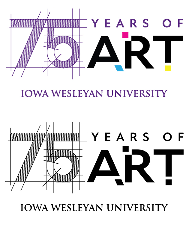
75 Years of Art
In 2022, the Iowa Wesleyan Art program celebrated its seventy-fifth anniversary. To commemorate this event, Art & Digital Media Design faculty requested a graphic suitable for email signatures, signage, social media, and possible web presence.
To honor the deep history of traditional art at Iowa Wesleyan, I searched for a typeface with a hand-drawn feel. The typeface chosen for the “75” numerals is reminiscent of graphite pencil, with strong geometric lines and architectural elements to complement the program’s background in printmaking.
During the process, the client requested inclusion of elements from an existing graphic made for the department by an IW alumna. The cyan, magenta, and yellow color boxes reflect the current department branding with that graphic.
CLIENT: BURLINGTON RIVERFRONT ENTERTAINMENT
The Haunted Auditorium
In 2020, the directors of a local historic event space contacted me with a new idea: The Haunted Auditorium. The Memorial Auditorium has been a fixture of the Burlington landscape for decades, and new leadership at Burlington Riverfront Entertainment wanted to create a unique annual experience.
My mission? Make a spooky logo.
I thought about what makes the architecture memorable for me, and kept coming back to the building’s unusual 3 x 4 perforated windows. I mimicked the facade using iconic pop culture horror weapons.
Sometimes a logo by itself can be hard for a client to envision, so I created some quick social media graphics to show how they could be used.

CLIENT: BURLINGTON PUBLIC LIBRARY
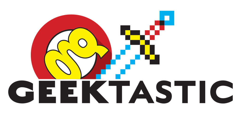
Geektastic
My local library kicked off a new, geeky pop media fan expo in 2018. They needed a fun, bold event logo that would wear well and appeal to multiple audiences. They also requested an emblem that would work separately for buttons, similar to Superman’s iconic diamond. I went for a sword and shield graphical components with elements to reflect the event’s superhero and video game themes.